
RetroCities Portfolio
A Portfolio That Boots Like It's 1996
Every developer eventually stares at their personal site and feels the same gravitational pull toward the same template. A clean hero. A soft gradient. Three little feature cards. Maybe a dark-mode toggle if you're feeling spicy. It's fine. It's also the exact site everyone else shipped this year.
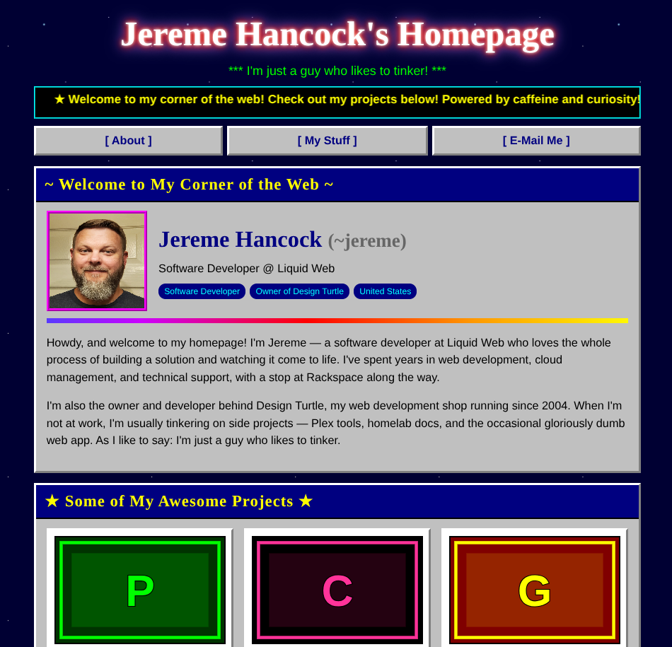
So I went the other way. Not forward into another tasteful minimalist layout — backward, all the way to the GeoCities era. RetroCities is a personal homepage that looks like it crawled out of 1996: a scrolling marquee, glowing chrome-effect headings, beveled Windows 95 panels, a tiled starfield background, and rainbow dividers doing their best to give you a headache. Instead of telling you I've been building websites since the Netscape days, the page just is one.
And it's built the way I like building these: pure HTML, CSS, and vanilla JavaScript. No framework, no build step, no dependencies. One HTML file and one JSON file. That's the whole thing.
It leans all the way into the old web
The easy version of this joke is a couple of neon colors and a Comic Sans headline. This one commits.
The title glows and shifts its hue on a loop. The tagline blinks, because of course it does. The content sits inside gray panels with raised, beveled borders straight out of a Windows 95 dialog, each one capped with a navy title bar. The background is a hand-rolled starfield built entirely from CSS gradients — no image to host, it just tiles forever. Horizontal rules are animated rainbows. It is, by every modern standard, gloriously wrong.
The twist is that under all that nostalgia it does the one thing no actual 1996 site could: it works on your phone. The layout reflows to a single column on small screens, the navigation wraps instead of overflowing, and the project grid collapses gracefully. There's even a nod to people who'd rather not be assaulted — if your system asks for reduced motion, every animation quietly switches off. Tasteless on purpose, but considerate about it.
The whole site is one JSON file
Here's the part that makes it more than a costume. All of the content lives in a single data/data.json file. Your name, your bio, your projects, your contact links — it's all described in one place, and the markup never has to be touched to change any of it.
The HTML is a template; the JSON is the truth. On load, the page fetches the file and hands each slice to a small render function that builds that section. Want to add a project? Drop another object into the projects array — a title, a description, a few tech tags, and a link — and it appears in the grid, fully styled, no code edited. Reorder them by reordering the array. Remove one by deleting it. The contact section works the same way: a labeled list where each entry carries its own link, so email opens a mail client and the rest open in a new tab, all driven by what's in the JSON.
It means the person updating the site doesn't need to read a line of JavaScript. They need to be able to edit a text file without breaking the brackets. That's a much lower bar, and it's the right one for a personal site you'll poke at once a year.
Thumbnails out of thin air
The detail I'm quietly proud of: there are no image files to manage. Every project card gets a thumbnail, but none of them are hosted anywhere. They're generated on the fly as inline SVG — the code takes the project's initials, picks a color pairing from a small retro palette based on the title, and draws a bordered, two-tone placeholder right there in the browser. Six projects, six little pieces of pixel-flavored art, zero uploads.
The favicon gets the same treatment: a tiny neon "world wide web" globe, also inline SVG, also no file. The entire visual identity ships inside the two text files.
And when you do have real artwork, you're not stuck with the generated version — every project has an optional image field. Fill it in and the card uses your image instead. Leave it empty and you get the retro placeholder for free. Sensible defaults, with an escape hatch.
Serving it (and the same one gotcha)
Because the content lives in data/data.json, the browser has to fetch it, and browsers only allow that over HTTP. So you serve it — python3 -m http.server 8000 while you're working, or just upload the folder to any static host, where it works without a second thought. Double-clicking the HTML file straight off your disk will open it, but a file:// page can't fetch the JSON, so you'll get a small built-in error message instead of your content. Worth knowing up front, because it's the one spot where "it's just two files" has an asterisk.
The upside is that deploying it is nothing. It's static files. GitHub Pages, Nginx, an object bucket, a container — whatever you already have. Park it at a domain root or a subfolder; it doesn't care.
Who this is for
If your personal site has been a "coming soon" placeholder for longer than you'd like to admit, and you'd rather it be memorable than tasteful, this is a fun way out. It's small enough to read top to bottom in one sitting, has no toolchain to keep alive, and the content lives in one file you completely control. Fork it, swap the JSON for your own details, and you've got a homepage with more personality than the entire gradient-and-three-cards genre combined.
It's also a reminder that "no build step" is still a perfectly good answer. The whole thing is two files and a sense of humor.
AI Disclosure
This project was created with the help of AI.
Links
- GitHub: jeremehancock/retrocities
- My RetroCities Portfolio : retrocities.jereme.dev